Project Details
Bloom is a florist mobile app. It’s a digital platform that serves people within the state of Hawaii and the surrounding islands who want to order flowers and bouquets from local florists. This project was a design challenge that was completed during my UX certification courses.
Challenge
Busy professionals and families want to purchase flowers online but are short on time and not always tech-savvy.
Target Users
Busy professionals and families who want to purchase flowers from a local Hawaiian shop.
Goal
A mobile app that allows users to purchase flowers quickly and efficiently.
Project Weeks
April - August 2021
My role
Sole UX Designer: user research, storyboards, wireframes, prototypes, usability study.
Tools
Figma

Preliminary Research
I began this project with user research in order to better understand the challenges and problems that users faced when they buy flowers.
Research methods implemented:
1. User Interviews
I conducted interviews on 5 participants during an unmoderated usability study. Participants all needed to buy gifts for family or friends and have previous experience buying flowers.
Interview questions:
- How do you prefer to buy flowers for someone?
- What are you looking for while purchasing flowers?
- What did you like and dislike about this florist app?
Empathy Map
After the interviews an empathy map was created to produce 2 user personas.

2. Information Architecture
To better understand how I would design the overall experience a user would have, I created this diagram. It shows how the content is organized to help users understand where they are in Bloom and where the information is located.
Sitemap

User Personas
After synthesizing the research data, I complied it as an aggregation of the characteristics and goals of people who were interviewed for Bloom to create these personas.
Michael
Micheal is 27 years old and lives with his partner and cat. He is a full time graphic designer and has been feeling overwhelmingly busy between working full-time and hanging with friends. In order to save time, Michael uses the internet to order his essentials and gifts like flowers.
Margaret
Margaret is 51 years old and married with 2 children. She’s a college professor of biology. Margaret loves to go shopping with her friends and buy flowers for each other on special occasions. She isn’t too tech-savvy, but is trying to give online orders a chance.
Design Phase
Now that I had a better idea of who the users were, and their goals and frustrations, I began sketching. This was to explore different ways a user might experience going through the steps of Bloom. I iterated on many different ideas for paper and digital wireframes before moving onto prototypes.
Storyboards
I drew these as a way to visually describe and explore a user’s experience using Bloom. This was my first attempt at completing storyboards. (I felt for my project Bloom, that it may have been too small in scope to truly derive value from these. Maybe if a project was much larger in scope and had more complicated user flows I could see this adding value to the design process. Nonetheless, they were fun to draw!)
Sketches
Testing the Product
After completing the wireframes I moved on to low-fidelity prototypes. I completed a usability study on more users, and compiled the data into a research plan. After analyzing the results:
The goal was to determine if users found the app to be simple to navigate and quick to order flowers.
Research Study Results
Time
Users don’t want to take the time to sift through a lot to find what they’re looking for to complete their purchases.
Process
Some users aren’t tech savvy and find the ordering and checkout process to be complicated.
Navigation
The pathway to ordering flowers is too complicated and needs to be intuitive.
Access
Users want better options to purchase individual flowers.
Design Iteration 1
- Created an optimal navigation flow with bouquets and flowers.
- Used better terminology when searching for bouquets.
Solutions
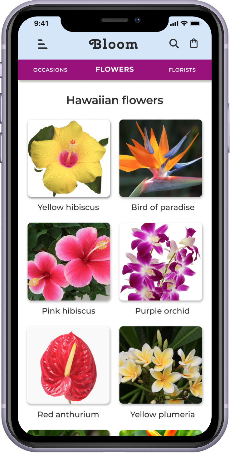
- Bouquets and flowers were separated into individual links.
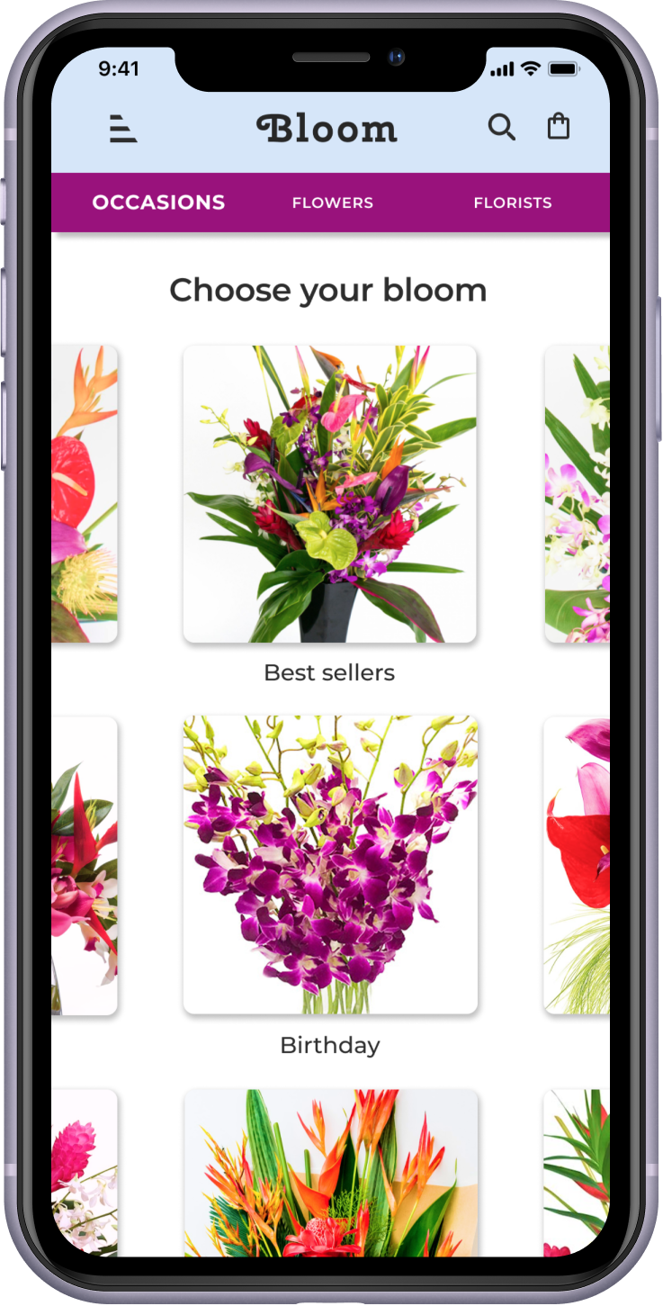
- Bouquets was renamed to “occasions” due to users’ search patterns when looking to make a purchase for a specific occasion.
What I Learned
- While condensing content is normal in design processes, in this case it was not.
- Breaking items down into smaller components can make visibility easier and create better navigation.
Design Iteration 2
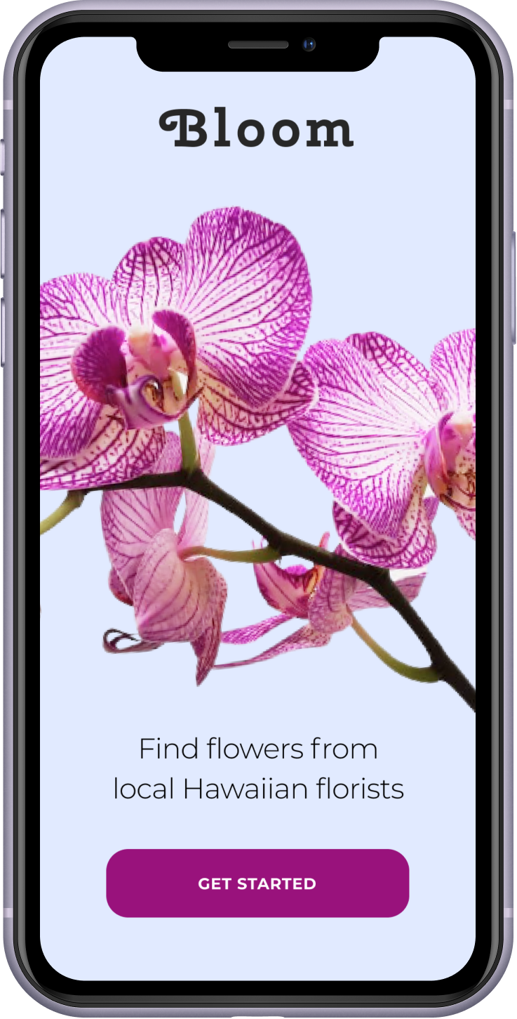
Created an engaging splash page that introduced the brand to the user in a simple but inviting way.
Solution
Included a brand image, a value proposition, and a simple “Get Started” for a call to action (CTA) button.
What I Learned
- Instead of assuming what I think users want, I have to design for what they actually need based on results from conducted research.
- I learned how to take advantage of a splash page and a value proposition for introducing brand identity.
Hi-Fidelity Design
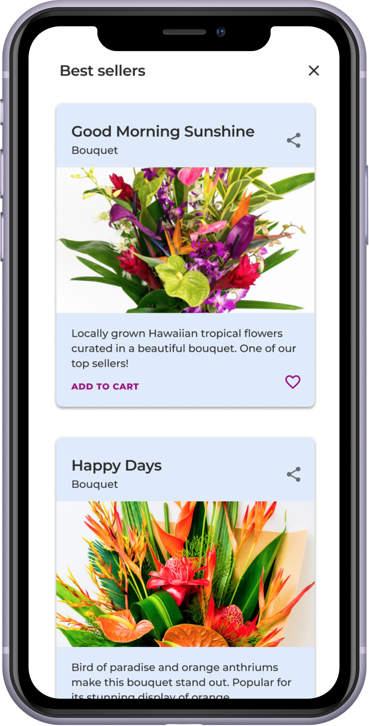
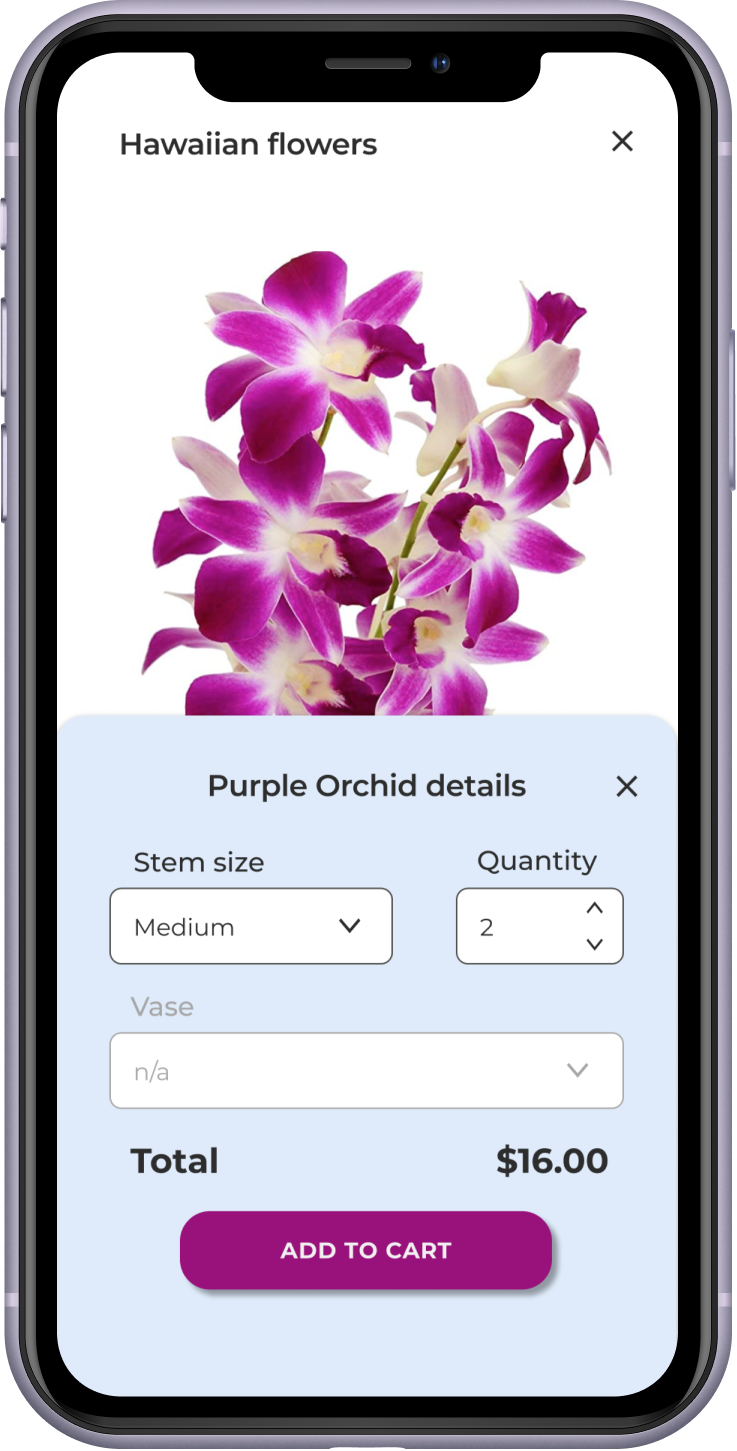
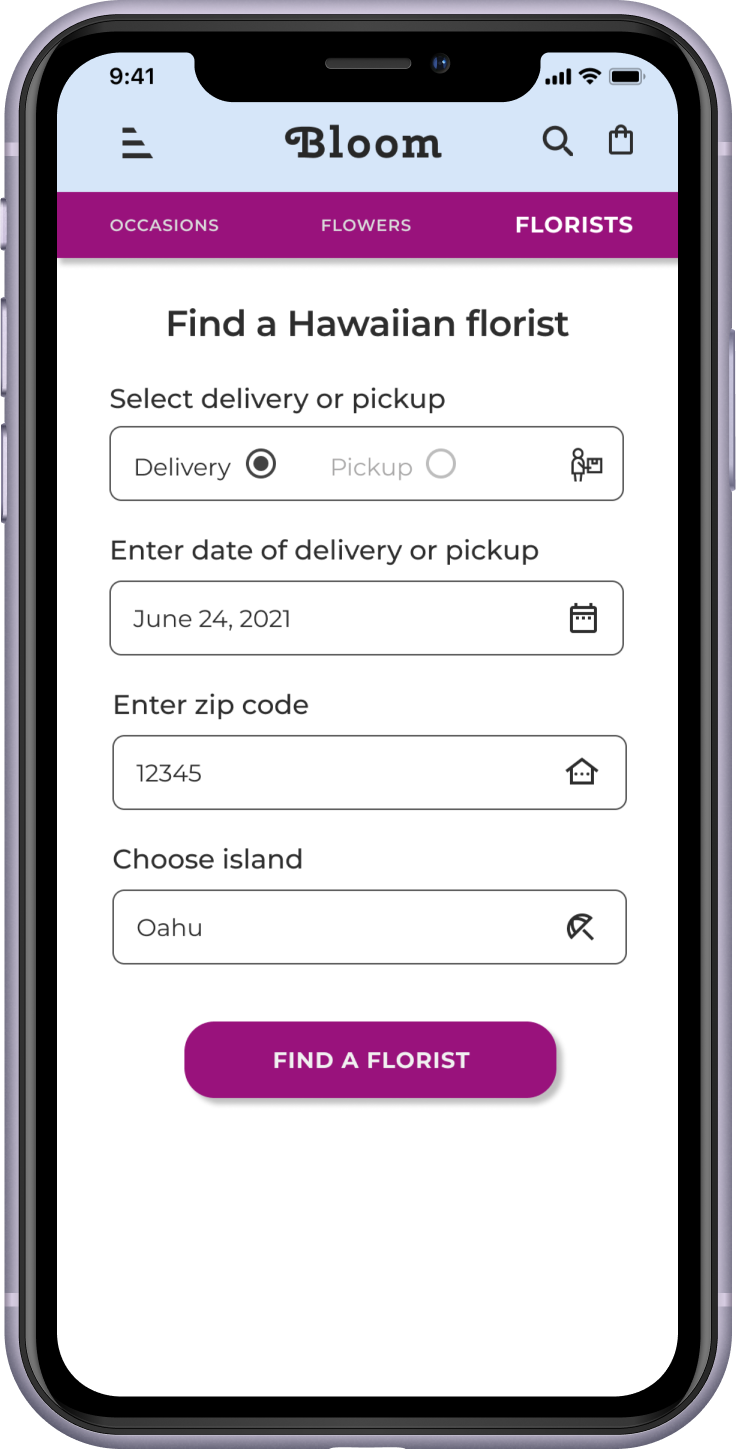
After synthesizing the results of the usability study, I designed hi-fidelity prototypes and interactive mockups. These designs reflect the final products of Bloom and includes visual elements, navigation, and interactive details.
Mockups



The Solution
Shop Occasions
After implementing navigation and user flow changes, users could now easily shop for different occasions such as birthdays and anniversaries without difficulties.
Order Flowers
By giving flowers their own navigation link, users could easily and quickly shop for individual Hawaiian flowers without having to take the time to scroll and search around the site.
Conclusions
What I learned:
- This was my first UX Design project and I learned a tremendous amount. (Which is a bit of an understatement!)
- Asking the right questions to craft a problem statement takes some practice.
- What stood out in this project was that one can never assume what the user really wants. It must come from user research to truly get the right information.
Next steps if I had more time:
- Add social media reviews to each florist on the search results page.
- Continue with user testing after each iteration to ensure a simple and easy user experience before the product launches.
- I would refocus my target users to include other stakeholders such as florist shops, suppliers, and hotels.
- Keep the sections simple where users enter data to ensure no matter how tech-savvy a user may or may not be, all users can access these areas in order to complete the checkout process and buy flowers successfully.
- I would add a recurring delivery feature in future iterations to keep customers coming back to Bloom.
- Identify if any further accessibility research is warranted, and if participants from underrepresented groups are fully included.


